Everyone knows the image. You see that fuzzy, white snout, the twinkling eyes, and that distinct red scarf, and you immediately think of a cold soda. It’s wild how a single coca cola polar bear photo or a 30-second clip can trigger such a specific sense of nostalgia. Honestly, it’s probably one of the most successful advertising pivots in history, mostly because it didn't feel like "advertising" at all. It felt like a short film.
The bears first lumbered onto our screens in 1993 during the Academy Awards. The ad was called "Northern Lights." It was simple, quiet, and kinda revolutionary for the time. Before this, the brand had used illustrations and various mascots, but this was different. This was early CGI—primitive by today's standards, maybe—but it captured something human in a non-human subject.
People often forget that the Coca-Cola polar bear actually dates back much further than the nineties. We're talking 1922. That’s when the first French print advertisement featured a bear squirted with syrup. But those early versions weren't exactly "cuddly." They looked like, well, bears. Realistic ones. It took Ken Stewart and a crew of digital pioneers to turn them into the icons we recognize today.
The Secret Sauce Behind the 1993 Coca Cola Polar Bear Photo
Ken Stewart was the creative lead at the time. He didn't just look at a polar bear and think "soda." He actually looked at his Labrador Retriever. Seriously. He noticed how his dog, Morgan, looked a bit like a polar bear when she was focused on something. He wanted the bears to have that same innocent, playful energy. This is why the bears in every coca cola polar bear photo since then have those expressive, almost puppy-like faces.
The technical side was a nightmare, though. You have to remember this was 1992-1993. Creative Artists Agency (CAA) handled the project, and they brought in Rhythm & Hues, a visual effects house that eventually won an Oscar for Life of Pi. Back then, rendering fur was basically impossible. Each frame took forever to process.
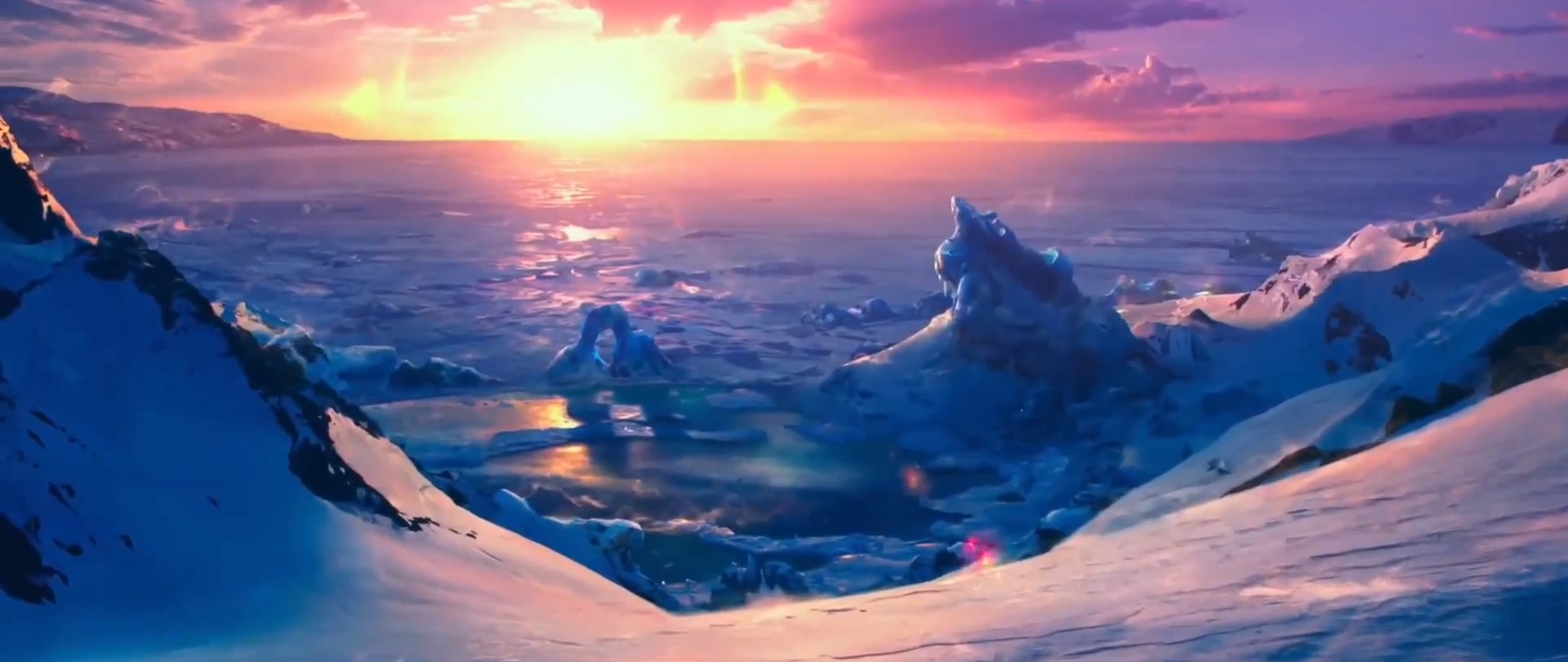
To make the bears look real—or real enough for a TV audience—they had to use sophisticated lighting techniques. They studied how light reflects off snow and how shadows fall across thick white fur. The goal wasn't just to sell a drink; it was to create a "Coke moment." That’s a term they used internally to describe a feeling of togetherness. The bears aren't just drinking; they’re watching the Aurora Borealis. They're hanging out. It’s relatable, even if you aren't an Arctic mammal.
Why the "Always Coca-Cola" Campaign Changed Everything
The bears weren't an isolated fluke. They were part of the "Always Coca-Cola" campaign, which replaced the "Can't Beat the Feeling" era. This was a massive shift in business strategy. Instead of one big, glossy commercial that ran for a year, Coke released dozens of different ads catering to different vibes. Some were edgy. Some were animated.
The bears were the "emotional heart" of that push.
What most people get wrong about the CGI
Many folks assume it was all done with computers from day one. Kinda. They actually used a lot of physical references. For the 1993 "Northern Lights" spot, they used a clay model as a reference point before Digitizing it. This helped the animators understand the weight and the "thump" of a bear moving through the snow. Without that physical grounding, the bears would have looked like they were floating.
The family dynamic
By the time the late 90s rolled around, the solitary bear turned into a family. We got cubs. We got the "Falling Down" ad where the bear slides down a hill. This wasn't just cute for the sake of being cute. It was a strategic move to appeal to families during the holidays. It worked so well that the coca cola polar bear photo became synonymous with Christmas, right alongside the Haddon Sundblom Santa Claus.
The Evolution of the Image in the Digital Age
As technology improved, the bears got more detailed. If you look at a coca cola polar bear photo from 2013 versus 1993, the difference is staggering. In 2013, Coca-Cola partnered with legendary filmmaker Ridley Scott for a short film called The Polar Bears.
That version gave the bears actual voices and distinct personalities. Some purists hated it. They liked the silent, observational nature of the original bears. But from a marketing perspective, it gave the brand a way to compete with high-budget animated films from Pixar or Dreamworks.
The bears also became a symbol for the company's environmental efforts. Around 2011, Coke partnered with the World Wildlife Fund (WWF) for the "Arctic Home" campaign. They actually changed their iconic red cans to white. It was a bold move. It was meant to raise awareness for polar bear habitat conservation. Ironically, it caused some confusion because people thought they were drinking Diet Coke by mistake, leading the company to switch back to red cans with white bears pretty quickly.
Real-World Impact and Business Nuance
Let's be real: advertising is about moving product. But the polar bears did something deeper. They created "brand equity" that survived the shift from traditional TV to social media.
- Cultural Longevity: The bears have appeared in Super Bowl ads, on giant 3D billboards in Times Square, and even as limited-edition plush toys.
- Emotional Connection: Most ads are annoying. People actively try to skip them. But during the holidays, people actually look for the bear ads. That’s a rare win in the business world.
- Global Reach: Because the bears don't speak (usually), the ads don't need much translation. A coca cola polar bear photo works just as well in Tokyo as it does in Toronto. It’s a universal visual language of "chilling out."
There’s a bit of a debate among historians and marketing nerds about whether the bears "saved" the brand's image in the 90s. While Coke was never really in trouble, Pepsi was winning the "cool" war with celebrities like Michael Jackson and Britney Spears. The bears gave Coke a way to be cool without being trendy. They were timeless.
Misconceptions about the "Coke Bear"
One big myth is that Coca-Cola invented the association between polar bears and the North Pole. Not true. The bears have been used by various brands for a century. What Coke did was "own" the visual. Now, if you see a polar bear on a holiday card, there's a 50% chance your brain flashes to a red logo. That is the pinnacle of psychological branding.
Another misconception? That the bears were always meant to be the "Christmas" mascot. Initially, they were just one part of a year-round campaign. They only became seasonal fixtures after the public reacted so strongly to the "wintry" feel of the first few ads.
Actionable Insights for Brands and Creatives
Looking back at the history of the coca cola polar bear photo, there are a few things we can actually learn and apply today. It’s not just about having a big budget; it’s about the "how" and the "why."
- Focus on the "Why" of the Character: Don't just make a mascot. Give it a personality. Whether it’s through movement, a specific look, or a silent interaction, the audience needs to feel something. The Coke bears weren't selling soda; they were selling a moment of peace.
- Embrace Technical Limitations: The original animators couldn't do perfect fur, so they focused on lighting and silhouette. If you can’t do something perfectly, lean into what you can do to create a unique style.
- Consistency is King: Coke has used these bears for over three decades. They didn't get bored and ditch them after two years. They evolved them.
- Visual Storytelling over Dialogue: In a world where everyone is shouting for attention, sometimes a silent, high-quality image or video is more memorable.
- Connect to a Cause: When Coke linked the bears to the WWF, they gave the mascot a purpose beyond commerce. Just make sure the packaging stays recognizable so you don't confuse your customers like they did with the white cans.
The story of the coca cola polar bear photo is really a story about how technology and heart can combine to create something that lasts. It’s about a guy looking at his dog and seeing a bear. It’s about a team of animators working through the night on computers that would be considered junk today. And it's about a company realizing that sometimes, the best way to sell a drink is to show a family of bears just hanging out, watching the lights.
Next Steps for Your Research:
- Check out the original 1993 "Northern Lights" commercial on YouTube to see the original CGI for yourself.
- Look up the "Arctic Home" campaign archives to see how the white can design looked before it was pulled from shelves.
- Explore the work of Rhythm & Hues to see how they transitioned from soda commercials to major Hollywood blockbusters.